The Kashida question
I’m working on a new project and the question of Arabic justification came up again. No system worth its salt can justify Arabic without first answering the question of where to insert kashida.
Kashida (which is a Persian word, also known as tatweel —elongation— in Arabic, among other names) is a horizontal extension of the connecting stroke between two Arabic letters. It is one of the two commonly used ways of elongating Arabic words to fill the line during justification (the other way is using alternate wide forms of some letters).
Here is Arabic poetry justified with a mix of kashida and alternate letter forms (by the renowned calligrapher Mehmed Şevki Efendi):
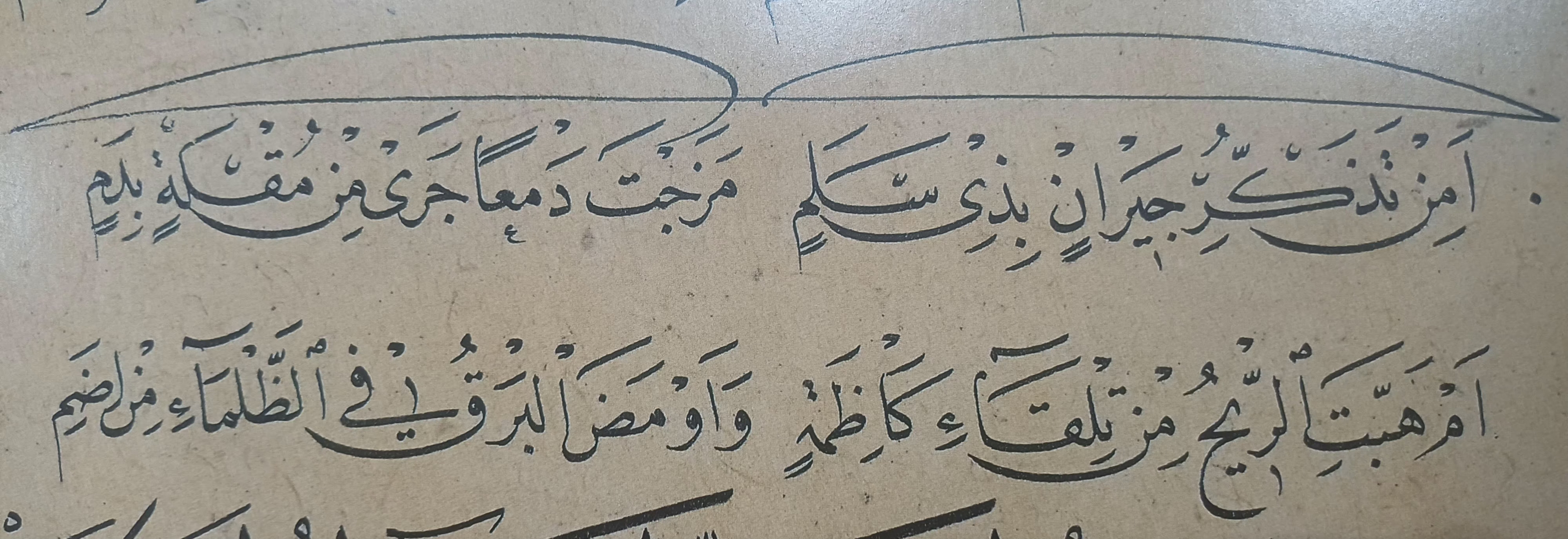
Arabic strongly prefers uniform spacing between letters and words (to the point that, in Arabic calligraphy, the inter-word space is the same as the inter-letter space), so increasing the spacing between words is frowned upon in good quality typography. Arabic also does not allow breaking words across lines, so no hyphenation either (well, kufi did break words between unconnected letters at line ends, but this is so ancient it would surprise any contemporary reader. Modern Uyghur orthography notwithstanding). So filling the space in Arabic is done by elongating words until the space is filled.
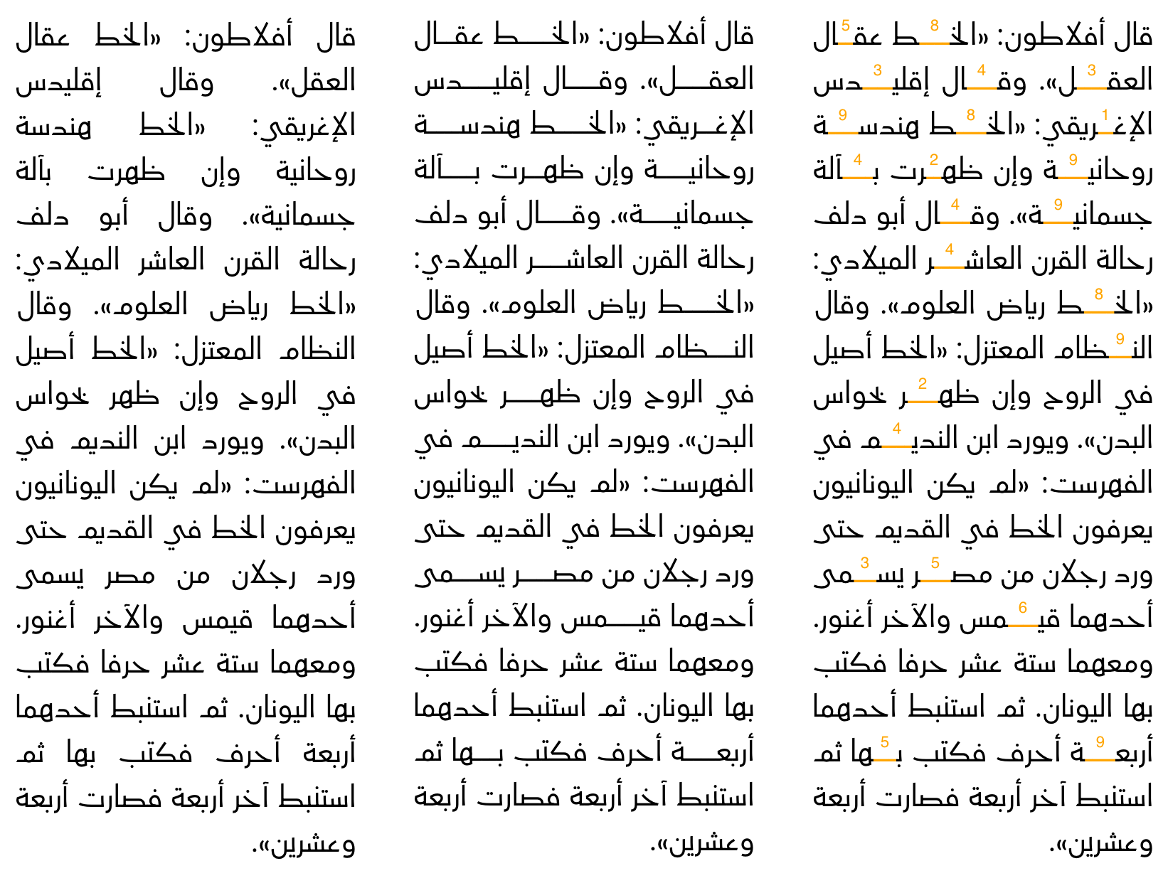
In the left column the Arabic is justified without kashida, leading to excessive inter-word spaces. The middle column shows the same text after kashida insertion, which evens the spacing giving the line more balanced look. The right column highlights each of the inserted kashidas and the number above each one is the priority of that insertion point (the higher the more desirable):
The problem with kashida is that you can’t just elongate anywhere in a word (or a line, but that is a different concern). There are orthographic and aesthetic considerations that have to be taken into account when deciding where to elongate a word. Some Arabic styles do not allow for elongations at all (ruqaa is the main example), others allow for elongations after very few letters (diwani, for instance, allows elongating the letter seen only). The rules also differ from one calligrapher to another, and what some resources allow, others deny. This results in a complex, and often conflicting, set of rules on where to elongate and how some elongations are preferable to others.
I worked in the past on the LibreOffice kashida implementation, cleaning it up and refining it within the limits of LibreOffice’s text layout justification architecture. One of the main limitations is that it uses one set of rules for any Arabic font. These rules are based on a set of kashida rules Microsoft published about an Arabic justification CSS feature that Internet Explorer had.
These rules, I believe, originated from the rules deployed by Arabic newspaper composers (Al-Ahram newspaper specifically) at some point in time, probably in the 50s or early 60s of the previous century. These rules were an approximation to the general Arabic elongation rules and were shaped by the limitations of the machinery of that era and the fonts that were used. They are fine for certain classes of fonts (very simple ones with limited interactions between their letters, or ancient ones like kufi where letter interactions were less elaborate), but for other classes of fonts (like more classical fonts with many ligatures or alternate glyph forms) they result in many aesthetically unpleasant elongations.
Since no size fits all, I started by working on a kashida insertion library that would support multiple sets of rules (the first version was in Python, then I ported it to JavaScript). I started by implementing the “simple” rules from LibreOffice and the Microsoft documentation, and intended to later implement a naskh set of rules suitable for more classical fonts, but I never did. I published the JavaScript implementation on GitHub and forgot about it for a while.
I did the naskh rule much later, but it was part of a larger project that I’m yet to publish. But even after adding the naskh rules, it still felt too limited, and assumes that a certain number of rule sets is fit for every purpose. Then at some point I had an idea that felt too obvious in retrospect; instead of hard-coding a few sets of rules, why not use a small pattern language, you know, like hyphenation patterns! Now I would have pre-defined sets of rules, but document authors can supply their own tailored for their needs and the fonts they use.
Long story short: I wrote a new library (written in Rust this time) that uses a small pattern language (loosely inspired by Knuth-Liang hyphenation patterns) to define a set of built-in kashida insertion rules. In addition to the built-in rules, the users of the library can also supply their own rules, or import one of the built-in pattern sets and override it with additional rules (the nastaliq pattern below is implemented this way: it imports the naskh rules then adds new restrictions and changes some kashida point priorities).
There are currently 4 built-in patterns, 3 Arabic and one Syriac pattern:
- Naskh: Arabic kashida insertion rules suitable for classical naskh and naskh-like typefaces (e.g. thuluth) that follow the classical rules of Arabic calligraphy and have advanced relations between letters.
- Nastaliq: Arabic kashida insertion rules suitable for classical nastaliq typefaces. Uses the naskh rules as a base with some tailoring for nastaliq.
- Simple: Arabic kashida insertion rules suitable for “simple” typefaces, i.e. those where letters have only the basic forms with no or very limited relations between letters (no or very few ligatures, contextual alternates, and so on). It is also suitable for kufi styles of Arabic in general.
- Syriac: Syriac kashida insertion rules, following the guidelines proposed for justified Syriac.
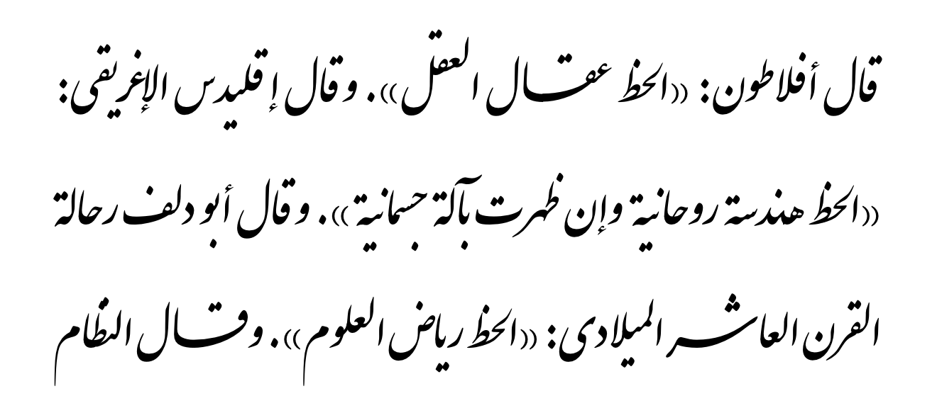
Here is some text set in the Iran Nastaliq font justified with nastaliq rules. The font only supports kashida in places acceptable in nastaliq calligraphy, so using naskh rules results in badly inserted kashida. The font is not perfect, though; some sensible kashida positions still render badly (I leave finding them as an exercise to the reader).
I’m not going to explain the pattern language here (I already changed it twice while writing this blog post), but it basically allows you to say where a kashida can be inserted and give a priority to each insertion point. The priority tells the consumer of the library which insertion points are more desirable than others, so the justification algorithm can insert kashida at the more desirable places first.
The pattern language is described in full detail on the library repository:
You can also consult the API documentation on how to use the library; there is even a full (but simplistic) example there for how to use the library during justification.
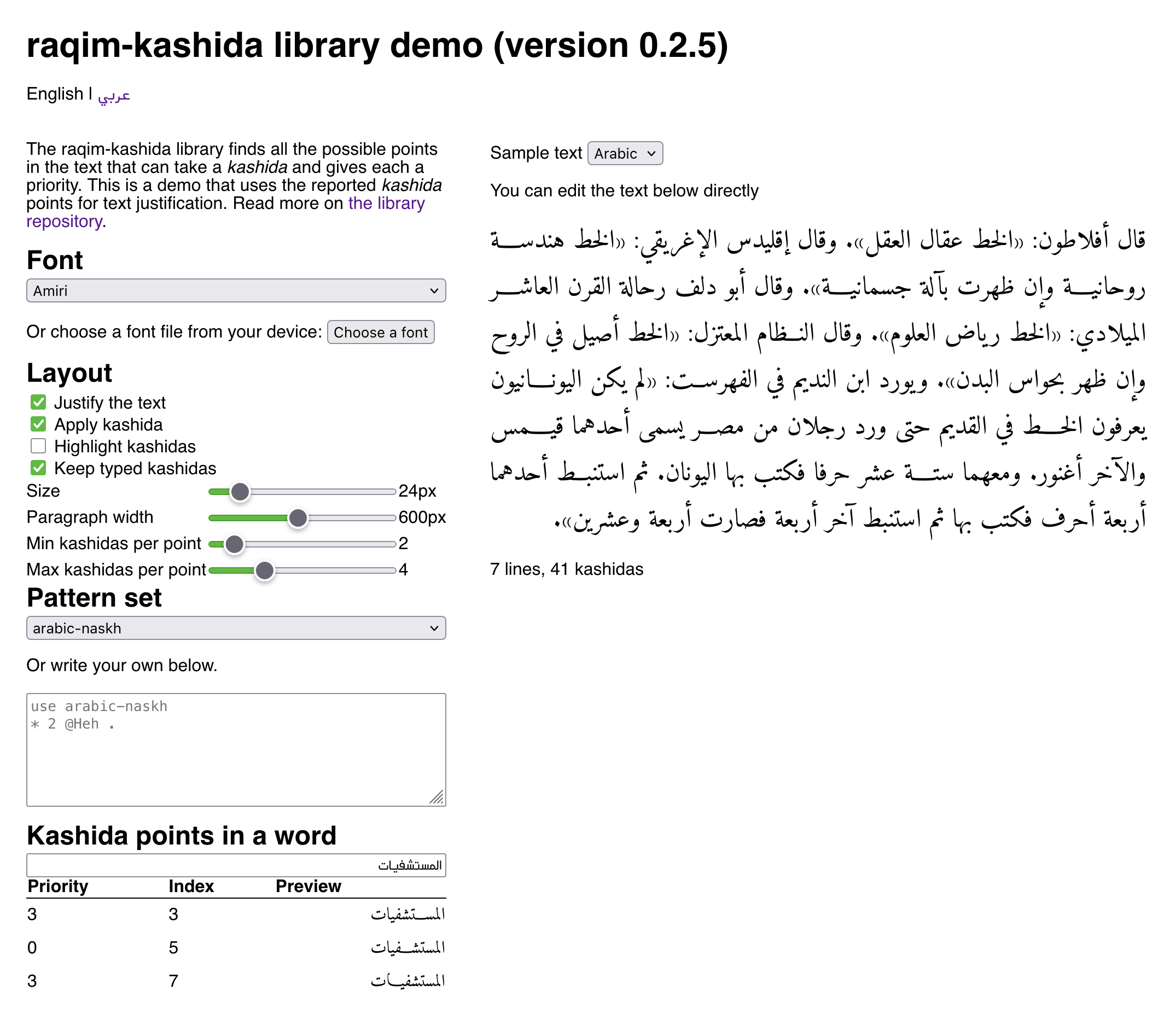
I also prepared an online demo that uses the library to find kashida insertion points and uses them to justify the text. The justification itself is not part of the library; it is a basic solution just for the demo.
This is still under active development, and I keep tweaking the rules as I use them, so feel free to contact me or report issues on GitHub if you have any suggestions.
One area I’d like to explore in the future is allowing fonts to supply their own rules, maybe as a custom font table, or by extending the (unused) JSTF OpenType table. This way a font can flag the places its design allows kashida to be inserted in, and give the more desirable places higher priority.