Qahiri — A manuscript Kufic typeface
Qahiri is a Kufic typeface based on the modernized and regularized old manuscript Kufic calligraphy style of the late master of Arabic calligraphy Mohammad Abdul Qadir.
Following the convention of naming Kufic styles after the cities they appeared in, Qahiri (قاهري) is named after the city of Cairo, Egypt (القاهرة).
Qahiri is a free and open-source project, anyone is welcome to use and modify it under the terms of the version 1.1 of SIL Open Font License.
The app
The font provides many alternate shapes for many of its glyphs, which should be usable in any OpenType-savvy application. But since many apps have poor OpenType support or bad UI or don’t allow controlling features for single glyphs, Qahiri comes with a web application that provides easy access to glyph alternates.
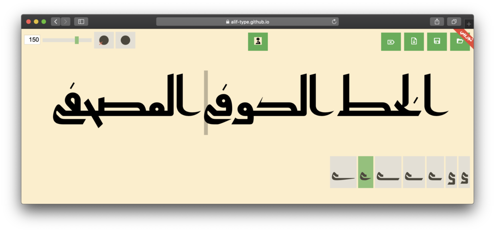
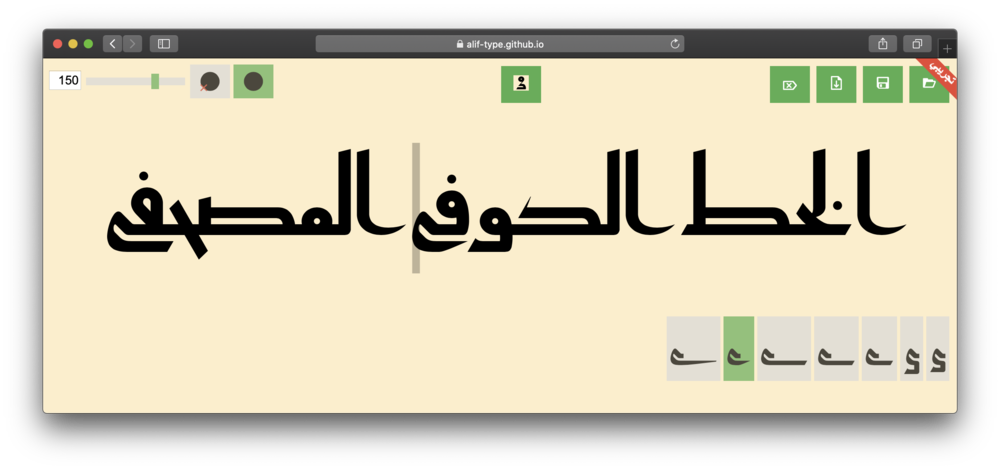
Visit the app web page and type Arabic in the text area. Next to the text, the alternates of the character before the text cursor will appear (the gray bar). Clicking on an alternate will cause it to be used instead of the current form:

The slider and the input box next to it control the text size.
Two buttons control the dots, the 

The 

The app allows exporting SVG files that can be further modified in any vector graphics application. Pressing Export button will download the SVG. The SVG contains also the current text with the selected alternates, and can be loaded any time in the app again using the Open button. Pressing the Clear button will delete all the text.
Font features
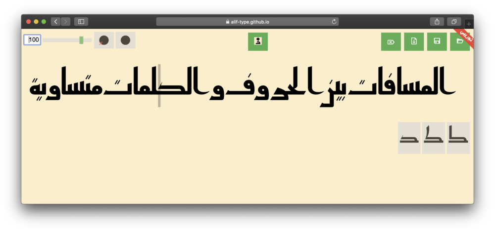
The font tries to remain faithful to the rules laid out by Mohammad Abdul Qadir, and one aspect of that is spacing. The space between letters, connected or not, as well as between words, is always about half the thickness of vertical stems. There is a distinction between inter-word and inter-letter spacing. Inserting more than one space character will increase the inter-word spacing.

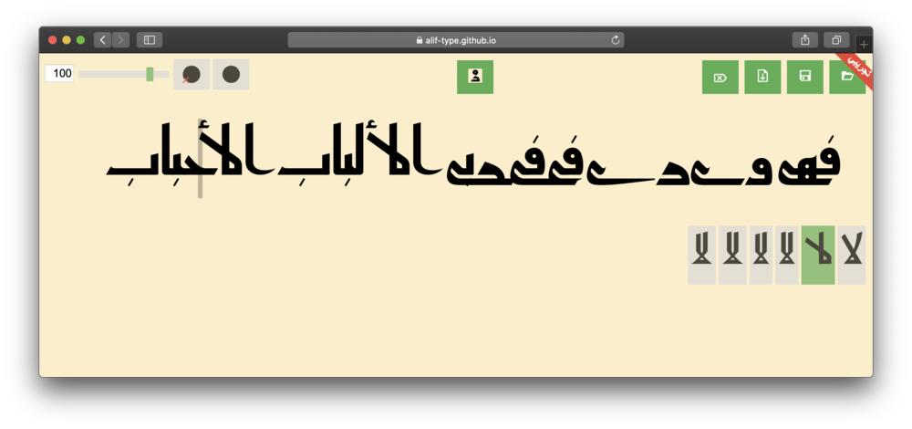
The letter forms used by default are designed to work together in harmony, but some of the alternate forms should be selected with care. For example, returning ya’ can clash with preceding letters with descenders and should be avoided in such cases. The font will try to solve clashes in such cases, but this does not always work.

Issues
The font is built using some advanced OpenType techniques that are not equally supported by software, and this might result in the font being broken in certain applications.
The performance of the application is also far from being optimal, so pasting large amounts of text should be avoided. Also, it does not support multiple lines; it works with one line at a time.